I’ll admit that I’ve been caught short this particular Friday, being unexpectedly detained in deepest Kent and being forced, at no pleasure to myself, to poke around a classic car storage warehouse the contents of which included a Ferrari Daytona, a 1989 Porsche 911 Carrera, a Fiat 130 and not one but two Talbot Sambas.
As I type this it’s just gone past 10pm and I was going to let this evening’s blog slide, especially since I’m off to pick up a new addition to the Fleet tomorrow with plenty of blogging potential. I don’t feel particularly good about that though so, apropos of nothing at all, here’s a list I’ve quickly cobbled together (having just walked in the door and fortified myself with a mug of tea and some chocolate HobNobs) of five car facelifts that just made things worse, in no particular order other than the one I think of them:
1) Austin Allegro 3
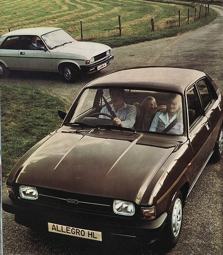
I actually mentioned this one a couple of weeks ago but here we go again. The original Mk1 may have been a little stylistically challenged, with its bulbous flanks and inset, squinty headlamps, but it had a certain neat coherence to it. Personally I like the results of BL’s brief fad (also implemented on the concurrent Marina) of fitting different grilles for different engine sizes, which helped liven up the range a bit as well as implementing some crucial Ford-style snob appeal. The original Allegro had enough chrome to liven up the front and rear ends which also drew the eye away from the most controversial design aspects.
A mild styling tweak in 1975 didn’t really alter much apart from the badging and a single black plastic grille for all the models. By 1979 a replacement for the Allegro was still nowhere near ready and there was no money to do anything major to the car to keep it fresh. BL’s third take on the Allegro was done on the cheap and looked it. The chrome bumpers were replaced by thick black plastic ones which just made the body look even more dumpy than before, whilst the grille was made into a single, bland slab of plastic (also black) which somehow manage to emphasise the car’s piggy-eyed frontal aspect. The colour range was also thinned out and all the oh-so-Seventies lime greens, oranges, yellows, purples and beiges which the Allegro actually wore quite well were replaced by dull, flat, dreary reds, blues and dark browns which did nothing to help the dreary looks. Neither did the plastic wheel trims instead of the neat, plain chrome ones.
2) Chrysler Avenger
The Hillman Avenger was not an interesting car in any way. It exemplified the Rootes Group approach of solid, conventional, rather dull but ‘competent’ cars. It’s three-box coke-bottle styling was pretty interchangeable with any other mass-market Ford, Vauxhall or Morris of the time. The one interesting point on the car was its rear three-quarter angle, where the rear pillar ran down from the rear screen in a sort of ‘buttress’, into the rear wing and ending in a unique L-shaped rear lamp cluster that no other British car of the time had anything like. The ‘hockey stick’ lamps just shouted ‘Avenger’ even at 200 yards and this was four decades before the current trend for manufacturers to do interesting things with the light units to create a ‘nighttime signature’.
In 1976 the Hillman Avenger became the Chrysler Avenger and was treated to a facelift which involved taking all the little distinctive bits of the design and throwing them away. The rear ‘hockey sticks’ went, along with the interesting wing shape, to be replaced by simple rectangular light units that could have been off anything. The front received large, equally angular light units that made the Avenger look like a Lada. When you’re car isn’t very interesting every little helps.
3) The Metro

The Austin/brandless/Rover Metro/100 (as I suppose it has to be called to encompass the full majesty of its various identities) was a classic Leyland product, being based on a 30-year old design and developed on a shoestring budget but packed with good, sensible features that made it so much more than the sum of its parts.
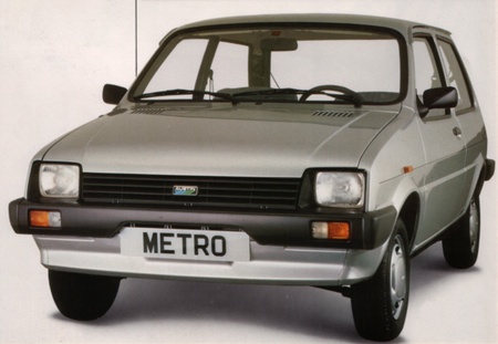
In facelift terms it’s interesting case because during the car had several styling tweaks and rebadgings and the car’s look alternated between bad and good each time these were carried out. The original 3-door car with the tiny inset headlamps and the shovel-shaped plastic front end was not, in my opinion, a good looker. It just looked, well, cheap and, like the aforementioned Allegro, a bit small in the ‘eye’ department.
The next facelift with the more integrated front end and the larger lamps set up into the bonnet line looked much better, especially the later ones with the body-coloured grille and bumpers. Of course the MG ones with the red seatbelts and the big Octagons on the doors look even better.

The real munter in the lifespan of the Metro is the first Rover-badged one. I’m beginning to spot a common theme in all these cars because to me the problem here is, yet again, big plastic bumpers and tiny headlamps. This is one of those looks that’s very colour dependant. On the classier Rover colours like dark metallic red or green it doesn’t look too bad but on the old Austin colours like white or pale blue it just doesn’t work. It gives the Metro the look of a Mk3 Ford Fiesta which is never a good thing, and then there’s that single-slot grille which looks like a giant CD player.The big plastic air scoops on the back edge of the bonnet don’t help things either. In more general terms the slightly more rounded styling just doesn’t seem to work as well as the original’s crisp-cut looks. It just looks like an old car that’s had its styling tweaked a bit.
The final incarnation of the car as the Rover 100 was a much better effort with the corporate Rover grille, rounder headlamps and body-coloured bumpers with little chrome finishers.
4) The Fiat Multipla

This one’s quick and simple, but also a little unusual because the facelift undoubtedly made the car better to look at, which was precisely the wrong thing to do.
The family MPV market has never been one to embrace radical thinking so I really admire Fiat’s bravado in launching a car so totally different in the looks department. Like most of the cars I admire the ugliness had a purpose- the huge, flat glass area made the inside very spacious whilst the odd two-tier front end meant that the drivetrain sat well away from the passenger cabin allowing for the Multipla’s trademark 3-abreast seating and flat floor. I’m also a sucker for any car marketed with a sense of humour in these days of po-faced ‘premium’ cars and the Multipla, with it’s rear window stickers saying “Wait Until You See The Front!” had that it spades.
Unfortunately it didn’t really sell well (with the exception of Roman taxi drivers, who loved it). So when Fiat began rebranding itself in the early 2000s they went and made the Multipla all boring. Boooooo!
5) Volkswagen Polo Mk2F
The Mk2 VW Polo exemplifies the best bits of Volkswagen’s best years. Before they started believing their own marketing hype they just made very good, very dull cars that were well though-out, well-built, practical and up-to-date. There is absolutely nothing of interest about the Mk2 Polo but its sheer competence and the unpretentious way it goes about its business makes it quite likeable.
VW styling in the ‘Eighties was thoroughly in keeping with their engineering- nothing special, nothing bad. It had razor-sharp edges and lines (especially the ‘bread van’ estate model which was the most popular in the UK), broken only by the round headlamps set into a bland but neat grille.
In 1990 the Polo was facelifted (creating the Mk2F) to bring it into line with VWs new corporate styling introduced with the Mk3 Passat two years before. Unfortunately the Passat was a much bigger car and was styled from the start to be a jelly-mould.
The 2F Polo took the clean, neat lines of the original and bespoiled them with rectangular headlamps, a chunkier grille, bigger and softer-edged rear light clusters. It was like the Metro, really- taking a design that was penned in an age when cars were angular and made from straight lines and trying to make it fit into a world of blobby, rounded shapes. It also spelt the beginning of the end for what little individuality there was in VW’s cars. It’s not so much that the 2F Polo is ugly but that it spoiled a really good piece of car styling.
